Design an accessible job search service to help new college grads
Project Overview
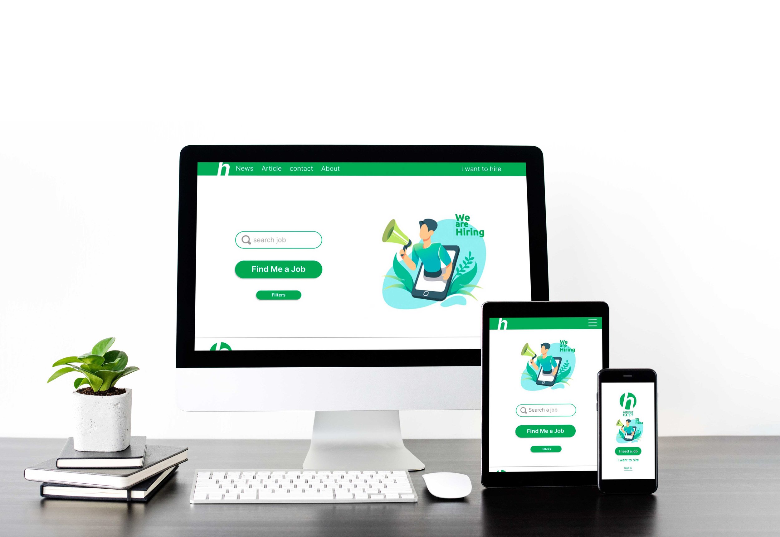
The product: This product is designed for employment by college graduates. Of course, all different strata of society can use this product. In general, this product is a place to find a job quickly without creating a profile and receiving subsequent emails.
The problem: Finding a job on similar websites requires creating a profile and registering a CV, which is removed from this website and connects people to companies much faster.
The goal: High speed to find a job and connect the job seeker to the employer in the shortest time without sending follow-up emails to the job seeker, which can sometimes be very annoying.
My role: Lead UX designer, UX researcher, UI designer
Responsibilities: user research, wireframing, prototyping,
User research summary: After checking many job search sites, I came to the conclusion that all these websites require creating a profile and spending time, and after that, you are only able to search for the desired job. Many of these sites, whose strength is in creating a network, unfortunately, turned into social media and moved away from their main function. The main idea of this product came to me when I was looking for a job myself, which only requires a resume, email address, and phone number. Then, instead of holding online training courses, the idea was replaced that a person looking for a job can learn about his basic rights while working and signing a contract through educational articles so that he will face fewer problems like this in the future.
You can check my case study here
Personas
Persona 1: Jadi
Problem statement:
Jadi is a College graduate who needs a related job to his major(Accounting)
because he needs to gain experience.
Persona 2: Mary
Problem statement:
Mary is a Ph.D. student
who needs a part-time job, she needs more money to pay her bills.


Ideation: We tried to provide a shorter and more convenient path for users of this product.

Wireframes & Mockups for App
Creating a difference between the two buttons for the job applicant and the company department, as well as selecting and changing the sentences on the buttons, made the user's pain points less and the user flow easier. Also, adding images helped make the original version look better.


Hi-Fidelity Prototype of App

You can check the Hi-fi App Here.


